Duo-Wei Yang
UI/UX Designer in Atlanta
Air Design System
September 2022 - August 2025
Building components, creating documentation and demos
From June 2022 to August 2025, I worked at Carrier as a UI/UX Designer. My role in Carrier's in-house design team was to create interactive prototypes for various HVAC projects and help build the up and coming design system for Carrier: the Air Design System. As an in-house design system allows design and coding work to be done more efficiently and have products that look cohesive with one another, this project was very significant within and outside our design team. All work was done with Figma and Adobe Suite.
.png)

Early Stages
The need for a design system
Carrier, being a large global enterprise, has many projects and products that require a user interface of some kind. However, it lacked a standard design language across its many platforms. Before our design team came along, much of the design work was done by consultants or teams outside the company. As a result, projects lacked a cohesive look and software engineers would have to take more time to code the designs to life. As a result, creating Carrier's design system was an urgent initiative to undertake.
Before I started working at Carrier, the design team already had started working on the design system, which was then dubbed the Fleet Design System (FDS). I was asked to created some possible branding and imagery:


I spent some time studying other established design systems to see how they laid out their guidelines and what were beneficial sections were essential or be highly beneficial for Air.
My general observations:
-
Clear illustrations, videos, or graphics of what to do and what not to do for design are important
-
Accessibility needs a dedicated section of its own
-
Dark themes are popular with users
-
Have a resource and assets page with download links
-
Tutorial on how install frameworks is important for software developers
-
Have rules on specific forms of design, such as repetition, contrast, and alignment
-
Explain and justify why certain components have a certain size or property for clarity
Overall themes to apply:
-
If there are some sections that are inevitably large (such as components), it would be best to divide them into subcategories upon subcategories
-
An emphasis on visual explanations might be wise, especially using animation/video for certain details.
-
It’s best to be able to quickly and easily switch to another page or look for something specific, especially since the information within a design system is vast.
-
The purpose of choosing certain design elements or decisions should be made extremely clear to the user/reader.
-
Use cases/templates are highly useful as they demonstrate clearly what the design system is going for.
Design workshops
In order to bring our new design system to life, we held two workshops. The first workshop's goal was to identify elements and principles we wanted for our design system. As a traditional and global enterprise, Carrier needed a design system that would align with its vision and initiatives. The design system agreed on the following principles:
-
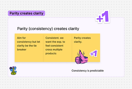
Consistency
-
Fleet components perform the same way across products, especially because Carrier covers a breadth of equipment, data, users, and interfaces – from reefers to chillers to access control.
-
-
Utility
-
Fleet balances data richness with simplicity. Data is at the heart of our digital products — constantly changing, infinitely complex. To maximize clarity and to emphasize usability, Fleet accommodates complex data functionality with visual language that is light and minimal, with controls and functions that are suited to purpose first.
-
-
Priority
-
Fleet highlights what's most important. Through color, size, customization, and scaling, Fleet directs attention where a user needs it. It is also flexible, allowing users determine which priorities require immediate attention and which can be shuffled back to focus on what's most important.
-
-
Predictability
-
Fleet celebrates behavioral expectations. Our customers need foresight to operate complex systems efficiently and avoid breakdowns.
-
-
Portability
-
Fleet components can be used to make software of any type. Fleet has the flexibility to support software design across our entire portfolio — today and in the future — and power user experiences that are distinctly Carrier.
-
-
Accessibility
-
Fleet is useable for everyone. In our line of work, ambiguity can be the difference between performance and failure. We strive to avoid ambiguity in our products, and the same is true for our customers.
-


After this workshop on creating design principles, the design team came to realize that the name "Fleet" didn't quite fit our Digital division and Carrier. We decided that we needed more consideration on our direction. As a result, we held a second workshop which focused on a comprehensive rebranding initiative and uploading the majority of our guidelines from Figma to Supernova.
One of our main activities was to brainstorm new potential names for our Design System. We followed these principles as a baseline:
-
Doesn’t undermine design principles
-
Not too industry-on-the-nose
-
Doesn't collide with design and industry norms
-
Not too serious, not too grandiose
-
Doesn’t conflict with current Carrier Business Unit, products, codenames, etc.
We also asked ourselves these questions:
Context
-
Where will the name live?
-
Digital: It will become its own website
-
Social media: Projects from this brand could be shared via social media (either on Carrier’s accounts or personal accounts)
-
Carrier’s website / Foundry website: It would be featured here in some way
-
-
How will people say, write, and read it?
-
“I made this for _______”
-
“I’m working on a _______ project.”
-
“Carrier’s _______”
-
“I saw this on Carrier’s _______”
-
-
Will it interact with any other names (brands)?
-
Because it’s on Carrier’s website, it would need to play well with the other branded names:
-
Scope
-
What is the brand today?
-
How could it grow in the future?
Competition
-
For similar brands, what names are other organizations using?
Stakeholders
-
Whose opinion should be considered?
-
Who should be involved?
-
Who are the key decision makers?
-
The entire design team
-
-
Who has the final say?
-
Ryan Young (Design System Primary Designer)
-

Our primary candidates were the following:


Based on votes and discussions between the senior designers, we decided that the Fleet Design System would now be rebranded as the Air Design System. We believed that it most closely aligned with our products and principles and is relatively different from other design systems out there.
Documentation
Writing guidelines
Earlier on, I was tasked to write guidelines for the Air Design System. I first started with the pages that would explain our foundations, such as its design principles and themes or styles. These introductory pages would give new users, primarily designers, an overview on how Air should be implemented.


The Air Design System comes in two categories: components and patterns. Components are the basic building blocks within a design system. Patterns functionally are the same thing, but are comprised of multiple components.
For each component or pattern I was assigned to, I would generally document each page with this structure:
-
Usage Overview: Describe when a component functions and how to best use it
-
Anatomy: Breaks down a component's features
-
Variants: different styles of a specific component
-
Colors: Components may have several different colors to indicate severity or to give the designer options
-
Sizes: Breaks down the available sizes of a component
-
Placement: Where the component is most often seen on a screen or patterns
-
Best Practices: What to do and what not to do when using a component
-
Related Component: To provide other components that function similarly as the current one may not be the best option for the designer
For several months, I had regular meetings with the lead designer for Air and several other engineers to discuss the best practices for each component and pattern. This was to ensure that components would be used appropriately. I was then tasked to create visuals for Air's best practices.
After a guidelines page in Figma was complete, we uploaded and link its contents to Supernova, a design system platform that connects Figma and Storybook (UI documentation tool for devs). This platform allows us to speed up design-to-code conversion and have all of our documentation in one place.
Our guideline pages appear like this on Figma and Supernova respectively:


Creation and presentation
Creating components and patterns
The meat of any design system, including Air, is ultimately its components. We first identified the essential "atoms," the smallest functional elements like buttons, icons, and inputs and ensured that they were linked to global design tokens, such as color and typography. Under the supervision of the lead senior designer, I helped build components and patterns based on team discussions around suitable sizing, scaling, and reusability.


Demos
Due to the large number of components and how complex Figma can be, I created videos to explain every component's usage, their variants, and best practices. With a company as large as Carrier, giving a personal tour to anyone wanting to use Air would be highly inefficient. Additionally, this can summarize the most important parts of a topic in a much more digestible way for users.
Each page in Supernova has a dedicated demo tab and video assigned to it and we provided accessible links in our Figma updates file.